
Oribox, Professional Poster Design
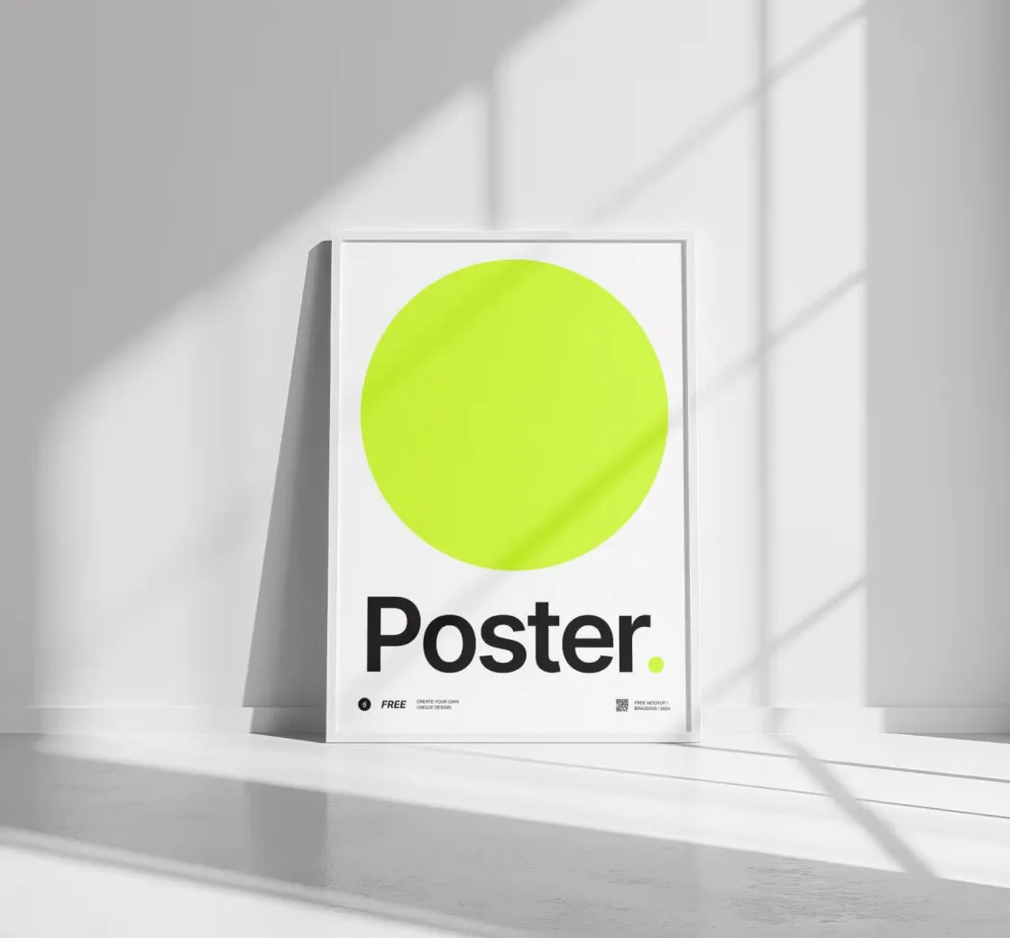
Oribox approached us with a clear objective: to design a series of high-impact posters that align with their refined, minimalist aesthetic.
Overview
Oribox is a modern lifestyle brand rooted in minimalism, precision, and premium quality. They needed a visual communication system, primarily through posters, that could instantly convey their refined identity.
- Client
- Devid Alan
- Industry
- Brand Assets
- Duration
- 2 Weeks
- Year
- 2030
The Challenge
Oribox’s brand voice is subtle yet strong. Designing posters that embodied this meant navigating a delicate balance:
- Minimal but Memorable: Avoid clutter while making a statement.
- Versatile Visibility: Maintain legibility at various scales and formats, from A1 prints to Instagram stories.
- Premium Perception: Design must feel high-end, avoiding overused visual clichés.
- Typography-Led Design: Messaging needed to take center stage, with no reliance on photography or heavy graphics.
01. Challenge
Oribox’s brand voice is subtle yet strong. Designing posters that embodied this meant navigating a delicate balance distilling a brand’s voice.
02. Solution
We created a modular poster design system rooted in timeless design principles. Every visual element was intentional and aligned with Oribox’s tone of voice.
03. Result
The final poster collection became a signature extension of the Oribox brand, instantly recognizable and visually aligned with their overall identity.
What Made This Special
This wasn’t just about posters, it was about distilling a brand’s voice into bold, minimal statements. Oribox proved that when less is done right, it speaks louder.